This is the forum archive of Homey. For more information about Homey, visit the Official Homey website.
The Homey Community has been moved to https://community.athom.com.
This forum is now read-only for archive purposes.
The Homey Community has been moved to https://community.athom.com.
This forum is now read-only for archive purposes.
Flows
Flows 2.0
(Pardon me if this is the wrong place for this discussion, I just felt that I had to put down my thoughts somewhere after actually digging into creating flows on my Homey)
Coming from the software development industry, I find the flow concept in Homey severely limiting. Not mainly because of the visual scripting, but rather because some fundamental limitations in the DSL forces me to structure my flows in a bad way. Some examples:
- Only one trigger per flow forces me to have lots and lots of flows
- Hard to reuse parts of flows
- inconsistent ways of passing data between cards
- I have to repeat myself a lot, even if I use concepts like virtual devices (which feel contrived in the first place)
- Have to resort to third party apps or Homey Script for non trivial scripting concepts (such as statefulness)
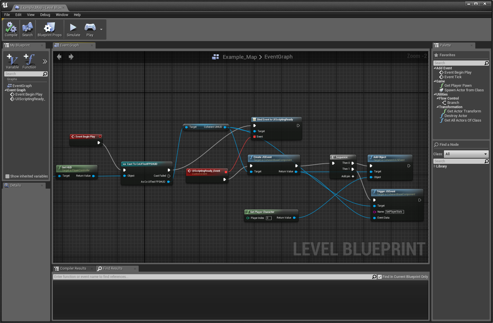
I just realized that I already saw what I think would be the perfect inspiration for Flows 2.0, the Blueprint scripting language in the Unreal game engine:

The beauty of this visual scripting language is that the logic is actually very readable and easy to tweak. Some of the nicer properties:
- Execution flow is a directed graph!
- Separates control flow from data flow!
- Multiple triggers and branching would remove redundant logic and make a single execution graph extremely poweful
- Very easy to extend (most nodes are basically a function)
- Very transparent state concept
- Asynchronous/delayed actions are very visible and it is clear how they will
execute
- Easy to group nodes and create subroutines (user can decide what part of the logic goes on what “screen”, and can group part of the graph).
- Still 100% “down to business” with no plumbing code needed, such as is the case with lower level concepts
- Existing flows are 100% expressible in this language
It may seem overly complex at first, but in my case it would actually make my logic simpler, as I now have one flow per scene per room, with additional triggering flows. With a more powerful visual scripting concept this could be handled with a single execution graph per room (more or less) and the resulting execution flow would be much easier to follow and maintain.
Coming from the software development industry, I find the flow concept in Homey severely limiting. Not mainly because of the visual scripting, but rather because some fundamental limitations in the DSL forces me to structure my flows in a bad way. Some examples:
- Only one trigger per flow forces me to have lots and lots of flows
- Hard to reuse parts of flows
- inconsistent ways of passing data between cards
- I have to repeat myself a lot, even if I use concepts like virtual devices (which feel contrived in the first place)
- Have to resort to third party apps or Homey Script for non trivial scripting concepts (such as statefulness)
I just realized that I already saw what I think would be the perfect inspiration for Flows 2.0, the Blueprint scripting language in the Unreal game engine:

The beauty of this visual scripting language is that the logic is actually very readable and easy to tweak. Some of the nicer properties:
- Execution flow is a directed graph!
- Separates control flow from data flow!
- Multiple triggers and branching would remove redundant logic and make a single execution graph extremely poweful
- Very easy to extend (most nodes are basically a function)
- Very transparent state concept
- Asynchronous/delayed actions are very visible and it is clear how they will
execute
- Easy to group nodes and create subroutines (user can decide what part of the logic goes on what “screen”, and can group part of the graph).
- Still 100% “down to business” with no plumbing code needed, such as is the case with lower level concepts
- Existing flows are 100% expressible in this language
It may seem overly complex at first, but in my case it would actually make my logic simpler, as I now have one flow per scene per room, with additional triggering flows. With a more powerful visual scripting concept this could be handled with a single execution graph per room (more or less) and the resulting execution flow would be much easier to follow and maintain.
Tagged:
Comments
This is the way athom choose to go to keep it simple for everyone (and not think of just the people that have an IT background), the only 1 trigger per flow now for example has a hard limitation of a choice they made at the start (regarding trigger tokens/tags), which might change with the new app, or not.
Just giving options to "they should use this" is not going to work, especially on this forum, it is called a community forum for a reason.
They will keep using flows, if that stays stuck on 1 trigger per flow or not you will find out in the future
If they wanted to keep it simple for everyone they should go the Apple way and add a lot of pre-baked automations for common tasks (such as, “turn light on if this is triggered, turn it back off in X minutes unless its state was changed”, “do X if value exceeds Y, but don’t retrigger if value doesn’t first go below Z”. And so on). This is something that could be done regardless.
At the very least I would hope that the flows and HomeyScript concepts eventually get
merged in one way or another, because usually I want to do something just a little bit more than what flows can do.
as there can only be 8 flow cards on screen at a time, without scrolling.
That is only the [THEN] don't mention when you add the [ELSE] as that halfs that screen.
Then changing like the dim bar, which is hiding behind the card below it, or need to scroll fully down to even see the bottom.
But first need to find my device, between all 118 devices, which I really don't remember all names of, so the search isn't always the easy way out and there is no option to choose a room, to select the devices from.
And don't forget the GUI getting so slow when there are 14 or more cards in the flow.
Or trying to put a token on the right place, waiting several seconds before i'm even able to.
Or when a card has many cards you need to scroll through all to find the right one.
The new interface will be a breeze, as every column will get the almost full screen size, with smaller cards in view, more cards in view then even on desktop!
And then Giving all the options of that card in 1 view, just by pressing it.. No scrolling, unless the amount of options is huge!
Searching a flow? Just click the device and you can see all flows it is in.
Disclaimer, the new interface story is purely based now on the current preview app (which still lacks things, but is already way better, especially in speed) and the screenshots already shown of how it will probably look like.
But just want to point out, no one has worked with the new app (finished) yet, and the desktop flow builder is seriously lacking and (really) slow on its own, especially when creating the "complex" flows everyone is talking about.
Expanding on this gui will only make it slower.
and has some hard limitations (3x or, then, 1x else) which can not be expanded on, at all, in the current GUI, without some mayor consequences.
I'm just waiting on the new app, and after that someone of the community to create this real 2.0 flow editor for on desktop, as that is totally possible with the api backend, already implemented by athom.
And please let this slow GUI fall away.