This is the forum archive of Homey. For more information about Homey, visit the Official Homey website.
The Homey Community has been moved to https://community.athom.com.
This forum is now read-only for archive purposes.
The Homey Community has been moved to https://community.athom.com.
This forum is now read-only for archive purposes.
Closed
When... And... Then... or?
in Archive
I would like to see some consistent and clear naming in the interface. I see When... And... Then... but would Trigger... Condition... and Action... clearer to the enduser?
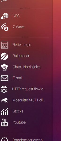
I would also divide the list on the left using the same analogy : Trigger... Condition... Action.... This means that we will/can see nodes more than once in the list but I don't see that as a problem. The user has a better understanding now of what he can do with the nodes and does not need to drag them to the editor to find out. Standard, I would fold each category and only 1 category can be unfolded at a time. This way the list isn't going to be that long. I see the current list becoming too long very soon and from an enduser perspective I don't understand why and how the nodes are grouped. There is no logic when looking at the information I want : what can I use in the When... And... and Then... columns.
I have also a hard time reading the words above each group. Impossible to read in the lower part of my screen.

Just an opinion, but I would change the current layout while you still can ;-)
I would also divide the list on the left using the same analogy : Trigger... Condition... Action.... This means that we will/can see nodes more than once in the list but I don't see that as a problem. The user has a better understanding now of what he can do with the nodes and does not need to drag them to the editor to find out. Standard, I would fold each category and only 1 category can be unfolded at a time. This way the list isn't going to be that long. I see the current list becoming too long very soon and from an enduser perspective I don't understand why and how the nodes are grouped. There is no logic when looking at the information I want : what can I use in the When... And... and Then... columns.
I have also a hard time reading the words above each group. Impossible to read in the lower part of my screen.

Just an opinion, but I would change the current layout while you still can ;-)
This discussion has been closed.
Comments
And even for those who have never done any programming, "When... And... Then..." is an extremely logical construction, because it's the way you also build sentences.
This I DO agree with... intuitively, what the user can use in either of these two sections, should be the same.
Of course when and then is less technical but let us not be fooled buyers of the Homey most probably are attracted to technology. I doubt if a not technie will ever get this to work. Tech all over the place!