This is the forum archive of Homey. For more information about Homey, visit the Official Homey website.
The Homey Community has been moved to https://community.athom.com.
This forum is now read-only for archive purposes.
The Homey Community has been moved to https://community.athom.com.
This forum is now read-only for archive purposes.
Closed
Request: Longer visible names or detailed list-view for devices [0.8.17]
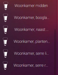
I just added a bunch of Hue's as a test, which are also connected to Hue apps and VeraEdge. Everywhere I can make practical use of the long names, which are needed to organize them and NOT get crazy in my mind. In Homey, it's very chaotic after they have just been added:

I know I can organize them into floors, rooms, etc.. That will help, but I will still NEED to rename them. That's a VERY time-consuming pity. A solution would be showing more text, smaller text, wrapping text, or creating a list-view. I request ANY of those solutions.
The same problem exists in the device-picker of the flow-editor, but the problem is smaller there, because more letters are shown:

Woonkamer, naast... Next to WHAT, I've got 20+ Hue's in my woonkamer and multiple ones "naast' (=next) to something.

I know I can organize them into floors, rooms, etc.. That will help, but I will still NEED to rename them. That's a VERY time-consuming pity. A solution would be showing more text, smaller text, wrapping text, or creating a list-view. I request ANY of those solutions.
The same problem exists in the device-picker of the flow-editor, but the problem is smaller there, because more letters are shown:

Woonkamer, naast... Next to WHAT, I've got 20+ Hue's in my woonkamer and multiple ones "naast' (=next) to something.
This discussion has been closed.

Comments
I've got many fixtures with 2 or 3 Hue's in ONE light, and also lots of them in the ceiling, spread out. It's suppost to be a commercially applicable demo-house for Domotica projects for people who want EXTRA.