This is the forum archive of Homey. For more information about Homey, visit the Official Homey website.
The Homey Community has been moved to https://community.athom.com.
This forum is now read-only for archive purposes.
The Homey Community has been moved to https://community.athom.com.
This forum is now read-only for archive purposes.
Closed
Improvements needed in Insights graph rendering engine
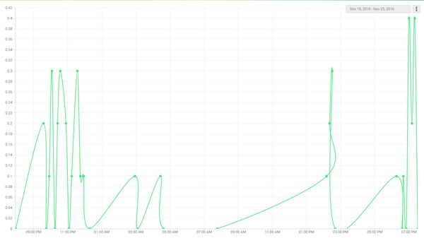
The current graph rending engine produces some strange graphs like this from the Netatmo rain meter. It shows a loop.
It also does not allow user scaling in X and Y.

It also does not allow user scaling in X and Y.

This discussion has been closed.

Comments